5 Reasons Big Sites go Mobile-Only and not Responsive

Mobile-Only (MO) and Responsive Web Design (RWD) are both great techniques to approach mobile-friendly web sites. (For background, see Mobile SEO: Responsive Design vs. Separate Mobile Site vs. Dynamic Serving.)
In fact, RWD is the only choice for redesign sites, simple sites and smaller sites (roughly those under 100 pages). For example, in 2014-2015, many “brochure” site owners switched over to SquareSpace.com and Wix.com. They realized they needed to be mobile-friendly – and could use a redesign at the same time. Because the site was small, the content was easy to port over, and – no need to hire an expensive web designer. RWD is a great compromise here, because with these stripped-down sites, the difference between mobile and desktop is minimal anyway.
It’s different for big sites.
For these site owners, here are some facts:
1. Google just wants your site to be mobile-optimized. They don’t care how you approach it.
Responsive Design is Google’s recommended approach, but for SEO, they aren’t going to penalize the big players for having Mobile-Only sites.
Dynamic Serving and Separate URLs will only be penalized by Google only if they are implemented incorrectly.
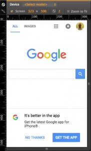
And they don’t use RWD themselves. Google.com uses Dynamic Serving to bring up a mobile friendly version of it’s site! (And so doesn’t Gap.com, Facebook.com and Yahoo.com)
2. On an existing, large, very complex or legacy desktop web site, RWD can be extremely costly to implement.
Why? Because a responsive design almost always changes the look of your desktop site – effectively forcing a redesign. In addition to unintended changes, RWD can introduce hard-to-find bugs throughout an existing, working desktop site.
It’s much less expensive to apply a lightweight, independent, skin or theme to an existing site, than to rework the existing desktop site.
As mentioned above, this isn’t going to be a problem on small and simple web sites – or sites which are being built entirely from scratch.
What about having to maintain multiple themes? Isn’t that more costly?
Yes, it can be. However, if your site has the proper architecture, you should be able to apply a mobile “skin” or “theme”, while keeping your core logic and back-end. This means you re-use most of your existing site. And your mobile theme is simpler than a combined, RWD, mobile/desktop theme.
3. Light payload for small mobile devices often favors MO.
Think about it. Why should 100% of the desktop content be downloaded for a tiny mobile device, only to have 50% of the content hidden from the user? Wouldn’t it be better to deliver only the minimal amount of HTML, CSS and Javascript the user needs? After all, the point is to give users on mobile a better experience.
4. Completely different content on mobile devices can be difficult to achieve using RWD.
Users on mobile devices may be in an entirely different environment than tablet or desktop users. For example, a desktop user may be in an office doing research on your product – very technical, lots of careful reading and clicks etc. On the other hand, a mobile user might be in a car on the way to the office (hopefully not driving!) and looking for a phone number. Mobile users favor download speed, swipe screens, and large tap targets to avoid “fat fingers”!
Of course, you can use techniques (like @media queries and flexbox) to change content based on screen size. However, this technique starts to break down as your mobile content becomes very different from desktop. For example, on desktop you prefer an standard photo gallery, but on mobile you prefer a swipe-style photo gallery.
5. The people running big sites have lots of different opinions on this topic.
From www.imediaconnection.com – “Looking at the 100 top-trafficked websites in the world reveals that 83 have dedicated mobile sites, 11 use responsive design, and four just have old-fashioned, non-responsive design.”
TLDR: As with most things, there isn’t a once-size-fits-all approach to MO vs RWD. You need to take your site into account to determine which approach works best for what you have.
Some useful links:
Responsive Web Design is not the Future
11 reasons why Responsive Design isn’t that cool!
Mobile SEO: Responsive Design vs. Separate Mobile Site vs. Dynamic Serving
You May Be Losing Users If Responsive Web Design Is Your Only Mobile Strategy